
Things you MUST avoid on your website
Make one or more of the following mistakes and your website visitors will leave your website in a flash.
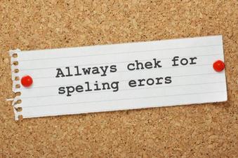
1. Spelling and grammatical errors
|
Proofread for errors in spelling and grammar. Do not rely on your software's spell checker! If you use the wrong word but it is spelt correctly, the spell checker will not pick it up.
Put fresh eyes on it - get someone else to check your text. Any errors will seriously damage your credibility . |
|
2. Distracting graphics
|
Fancy graphics might look good - but do they actually achieve anything? The most important thing about your website is that your site visitor can find, see and understand the information that they are looking for.
Not only can fancy, moving graphics be completely distracting, they might not display correctly on everyone's computer, tablet or mobile phone. Only use fancy graphics if it is relevant to what your website is all about. |

|
3. Complexity and jargon
|
Keep things simple! Studies have shown that a web page has just three seconds to make a first impression that will hold the viewer's attention.
Don't make your website too busy. Make sure you only use language or jargon that your target audience will understand. Use plain English, and keep sentences short. |

|
4. Links or features that do not work
|
It's critical that every link and feature on your website works - if a site visitor gets an error message, or nothing happens when they click on a link, your credibility and reputation can be shattered.
From time to time make sure that you visit your own website and make sure that everything is working correctly. Disgruntled visitors are not likely to tell you - they'll just move on to another website. This is another good reason to keep things as simple as possible. |
|
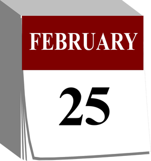
5. Incorrect or outdated information
|
Make sure that you keep your website up-to-date. Let your site visitors know that they are looking at an updated website by including a recent date or year in the footer of each page.
If any key information changes (such as telephone numbers, opening hours, prices etc.) then you must update this on your website straight away. If a visitor gets the feeling your website is showing outdated information, they will quickly move on. |
|
6. Fancy fonts and colours
|
You must avoid turning your website into a Picasso! Mixing lots of different colours and font types will just confuse your visitors. Use a consistent style, size and colour for your headings, and use another for body text. First and foremost you want your text to be easily seen.
Be careful to avoid colour combinations that make text hard to read. Research indicates that text is easier to read if it is presented as dark lettering on a light background. However, reverse things occasionally to make certain things stand out.
|
Clear heading.....Clear text..... Look here! |
7. Dead ends
|
Make sure every page on your website has one or more links to others. Pages that don't allow the visitor to easily navigate to another page are known as orphan pages.
It may not always be obvious how to get back to your "home" page, so don't lead them down any blind alleys - it will drive them barmy! |

|
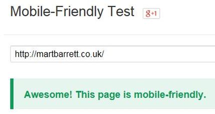
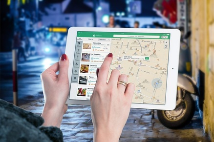
8. Hard to see or use on mobile devices
|
People are using a variety of devices to access the Internet these days, including mobile phones and tablet computers. This trend seems likely to rise. It is essential that your website is accessible on all these devices.
Websites that are not "mobile-friendly" may be penalised by Google in terms of how well they rank for search results. |
|
If you want to know whether your site is "mobile-friendly" then I will check it for you. Just let me have the website address and your email address and I will send you Google's feedback.
9. Poor navigation
|
If surfers can’t figure out where to go next quickly and get there easily, they’ll simply move on to the next website. Don't force people to go back two or three pages to get to other areas of your site.
There should be a navigation bar on every page that guides visitors to other areas of the site. Position the bar along the top of the page or along the left side. Buttons that take visitors to certain pages can be placed anywhere on a web page, and are particularly useful for people using mobile devices. |
Make life easy for your visitors!
|
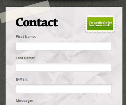
10. Unclear website objectives
|
It's all well and good having a beautifully designed website. But you must always focus on the purpose of your website. The very first thing you should do when creating your website is to work out what your objectives are.
If you want your site visitors to contact you then make it very easy for them to do that. Make your contact details very clear or use website forms to collect information. Make life easy for your visitors, and don't make them dig deep to find your contact information unless you have good reason. |
|

